Why Do Games Use Yellow Paint?
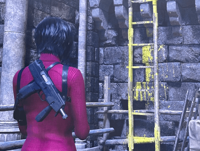
Yellow paint exists because it works. In complex 3D environments filled with detail and texture, players can easily miss climbable ledges or critical objects. Bright yellow, a color rare in natural landscapes, instantly catches the eye.
Developers discovered this through extensive user testing. When multiple players failed to spot a ladder or missed key pathways, designers were forced to choose between subtlety and clarity. Often, clarity won.
“We watched a dozen players walk past a critical ladder again and again. Adding a single swipe of yellow paint fixed the issue across the board. From then on, we applied it consistently.”
This approach ensures a smoother player experience—but it also raises a key question: at what cost?
Key Takeaways
- Yellow paint is a visual cue used in games to signal climbable surfaces, interactable objects, or critical paths.
- Its overuse has led to criticism for breaking immersion, but it’s a proven tool born from years of player testing.
- Modern alternatives exist but often require more development time and resources.
- For aspiring designers, yellow paint represents a broader lesson: clarity in player guidance should never come at the expense of fun or immersion.
The Rise of the Yellow Paint Debate
The term “yellow paint” became shorthand for an overused visual trope after major releases like Resident Evil 4 Remake (2023) and Final Fantasy VII Rebirth (2024). Players began noticing—and then mocking—the abundance of yellow highlights slathered across ladders, planks, crates, and ledges.
“Once you see it, you can’t unsee it. Every ladder screams ‘game design’ instead of blending into the world,” wrote one frustrated player.
This criticism isn’t limited to players. Several veteran developers have expressed concern about how these cues, when overused, undermine environmental storytelling and player immersion. But defenders argue that it’s the result of hard-won lessons from decades of design: players prioritize flow over realism.
Why Developers Keep Reaching for Yellow Paint

Player Guidance Made Simple
In cluttered environments, even carefully designed climbable surfaces can blend into the background. Yellow stands out sharply, even in dimly lit or photorealistic worlds.
Playtesting Pressures
Many studios conduct rigorous playtests in controlled settings. Developers watch players fail to notice ladders or doors—sometimes multiple times in the same session.
“You can’t ship a game where players routinely get lost in minute two. Visual cues like yellow paint solve that immediately.”
Consistency Across the Game
Once a visual language is established—“yellow = interactable”—breaking it can confuse players. To avoid this, designers often feel compelled to apply the marker universally, even where it might not strictly be needed.
Breaking Immersion and Player Fatigue
Environmental Believability
Why would every ladder, ledge, or crate in a realistic setting be painted yellow? For players seeking immersion, this logic gap can pull them out of the experience.
Hand-Holding
Over-reliance on bright cues removes the satisfaction of discovery. Instead of exploring, players follow a painted path.
Visual Clutter
What began as a subtle guide has become so conspicuous that players now joke about it in streams, memes, and reviews.
“We used to marvel at worlds that felt lived-in. Now I feel like every environment is screaming directions at me.”
Smarter Alternatives to Yellow Paint
Environmental Storytelling
Games like God of War Ragnarök use natural etchings and subtle wear patterns to guide players instead of bright paint.
Landmark Navigation
In Breath of the Wild, players are naturally drawn to distant landmarks like the Temple of Time. No arrows or paint required.
Texture and Lighting Variations
Developers can vary surface textures, add scuff marks, or adjust lighting to subtly draw players toward interactables.
Breadcrumbing
Placing enticing minor rewards along a path (coins, collectibles, NPCs) can nudge players forward without overt markers. These techniques require more design iteration and playtesting, but they often result in more immersive worlds.
The UX/UI Perspective: Navigating Clarity vs. Immersion
Yellow paint sits between traditional UI (HUDs, menus) and UX (invisible design choices shaping player behavior). Designers face a tough choice: prioritize immersion and risk confusion, or ensure clarity and risk breaking the illusion. Most teams lean toward clarity, especially in large worlds where frustration can lead to players quitting.
“A painful tradeoff, but players remember fun, not realism.”
What This Means for You
If you’re an aspiring designer, yellow paint teaches a crucial lesson: design isn’t about what looks clever—it’s about what works for the player.
- Player Testing Is Key: Your intentions don’t matter if players get lost. Watch how real players interact with your levels.
- Build Consistent Visual Language: If players learn a rule early, apply it universally—or be prepared for confusion.
- Balance Guidance and Discovery: Players enjoy figuring things out. Find subtle ways to nudge without overt hand-holding.
- Time and Resources Matter: Elegant alternatives take more iteration. Factor this into your production timeline.
Aspiring designers should study both good and bad examples of yellow paint. Ask: where does it help? Where does it harm? Could a smarter cue or level design avoid the need altogether?
The Future of Navigation Cues
As players grow more attuned to design tropes, studios are exploring adaptive solutions:
- Visual cues that appear only after failed attempts.
- Optional toggles for navigation aids in accessibility menus.
- Environmental design that naturally funnels players toward objectives without explicit markers.
The challenge is clear: create worlds where players feel guided, not herded.
FAQ
Why yellow specifically?
Yellow offers high contrast in most environments without implying danger (unlike red). It’s universally visible and attention-grabbing.
Can developers just use more subtle cues?
They can, and many do, but subtlety often fails in user testing, especially in visually dense worlds.
Can I disable yellow paint in games?
Some modern titles include options to turn off navigation aids. A Quiet Place: The Road Ahead is one example.
Do other colors ever get used?
Yes—blue for interactables, red for danger—but yellow remains dominant due to its visibility and neutrality.
Is Yellow Paint Really Lazy Design?
Yellow paint isn’t lazy—it’s pragmatic. It emerged from years of testing as a reliable solution for a difficult problem: guiding players without breaking gameplay flow. But like all design patterns, overuse dulls its effectiveness and risks becoming a crutch.
The best designers look for balance, experimenting with cues that feel natural within their worlds. As games push further into realism, future solutions will need to feel invisible—until players start noticing those too.
