
What Is Game UI?
User interface. Where does one even begin when discussing the user interface? Perhaps we should start with what it is?
It’s basically the parts of your game the user interacts with in order to play your game. It’s everything about the controls and the screens that the player interacts with in order to play the game.
Game UI vs Game UX
UX stands for user experience, and it’s inseparable from UI. Game UX is an integral part of the development process. One without the other is a half-finished product.
These definitions barely do the terms justice, but you’re here for inspiration! Not for lesson learning! So, without further ado, we bring you ten cool examples of game design, from which you should pull some inspiration!
One quick further ado that we said we wouldn’t do… the user interface is an almost comically contentious subject matter. We recognize that different people are going to enjoy certain things, while others are going to hate them.
You can’t please all the people all the time–it’s a good lesson to remember! Don’t be afraid to stick to your guns, even if you get some negative feedback mixed in with the positive.
Our Favorite Video Game UI’s
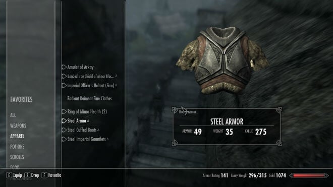
Skyrim/Fallout
This is one of those point-of-contention examples of UI.
In Fallout, some people didn’t like the time it took for the character to bring his Pip-Boy up into view. But a lot of other people liked it. When you have this kind of diegetic UI immersion, some people really appreciate it.
Similar contention surrounds Skyrim. The skill trees are designed to look like constellations, which is both beautiful and neat–most people like that. But to get to potions or pick spells, you’re forced to pause the game and spend a significant amount of time on the screen picking these things out.
You can “favorite” them, but that list quickly grows unwieldy the more spells you learn and weapons you acquire.
The important takeaway is that “users are more tolerant of minor usability issues when they find an interface visually appealing”– it’s a quote from this study, feel free to read more about it.
You want to keep it simple, and make it visually appealing… is there any way to turn one of your menus in a simplified Pip-Boy or constellations?
Firewatch
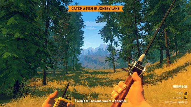
This beautiful game has a super minimalist design. It doesn’t give you, the player, any more than you need in order to interact with the world. It effortlessly teaches you the pattern of what objects you can interact with since it follows closely with how the player interacts with objects in the real world.
Is there a way for you to cut back on the HUD? Is there a way to strip down how apparent your UI is in the game?
Hearthstone
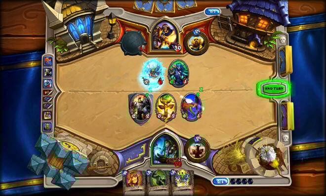
We wanted to include this because, first of all, it’s a fun UI. The tavern feel is great, the idea that you have this “box of cards” is really neat, and they manage to explain a very complex game in a very simple way.
It took Blizzard a long time and a lot of bad ideas to get Hearthstone to the version we now know. Check out this YouTube video for the scoop on that journey.
WoW
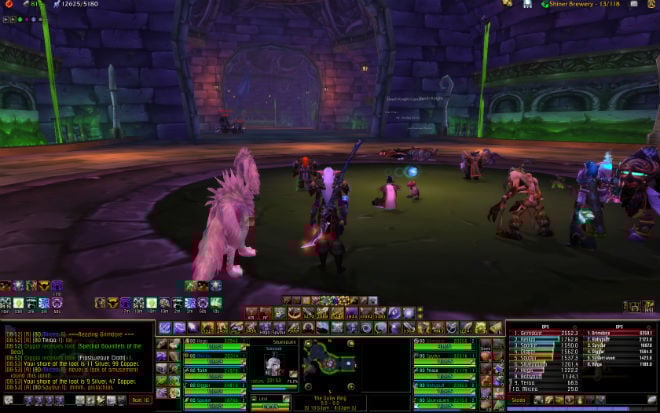
Some people hate it without mods. Other people say it’s not bad, it’s just dated. And still, others praise the WoW UI for it’s customizability.
We have friends who’ve spent more than a single hour organizing their windows in a very specific way. Is there a way to be more flexible in your UI? To give some customization options to the players?
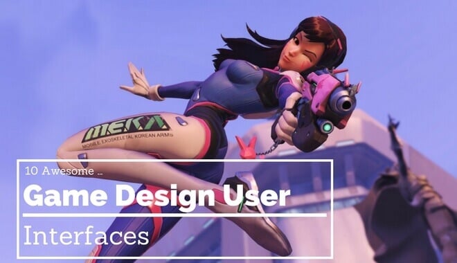
Overwatch
Did you smell a third Blizzard game? Did you know it was coming?
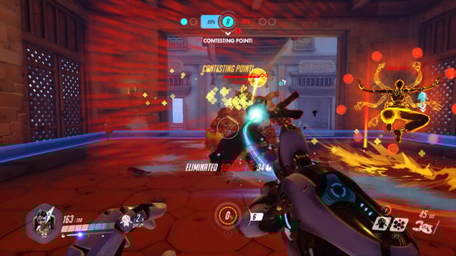
Overwatch is neat because the game does such a good job of teaching characters without actually teaching them. Really, the only help you get for playing characters is what to do to avoid dying from the characters you’re facing.
“Avoid getting too close to McCree when his flashbang is available,” or “Finish off roadhog quickly when he’s at low health before he has a chance to restore health with ‘Take a Breather’.”
Those aren’t direct quotes, but dialogue boxes pop up containing those tips anytime you die, and they usually tell you how to avoid dying by whatever character killed you. Each character has very distinct moves, and the icons for those moves are very clear.
If you ever forget, you can hit a button and a screen will pop up describing your character’s moves and button mapping. The game reminds you of that with a “Tap this button for player details” notice, but never in a way that’s distracting. It’s only there when you need it–that’s a mark of good UI design.
Plus, the opening screens are always fun. A random character pops up on a random level and entertains you while you scroll the menu and decide what to do.
This video that we just linked to shows just about everything we’re talking about if you want to see it for yourself!
Cogmind
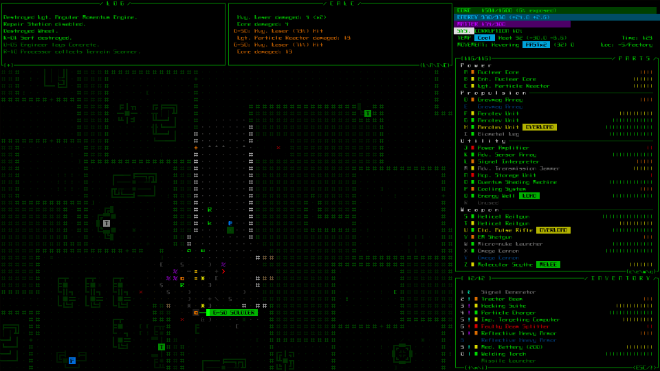
This is a really interesting game, where the art style permeates every aspect of the game. It’s a good example of how your UI can excellently embody and even expand the aesthetic themes of your game.
That’s all we need to say about it! Watch this video to see what we’re talking about.
Deadspace
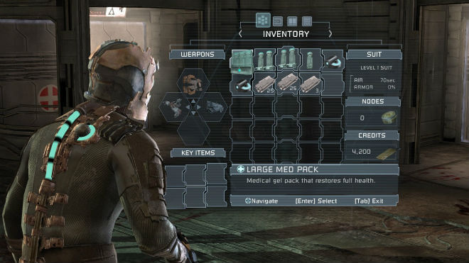
Anytime you ask a group of people about solid UI, Dead Space is going to come up. It’s the game when it comes to integrated UI. And the praise isn’t undeserved.
It is super immersive. When you open a menu, it doesn’t pause the game. You project a hologram into the world that has the information you’re looking for.
The fiction is that it’s built into your suit. It pretty much works… meanwhile, you’re still vulnerable to attack. That keeps you immersed in the game. You can’t pause for a breather with the pause button.
Your character’s health/status is shown via a neon apparatus on the back of your suit. You’re not looking at a 2D HUD health bar, you’re just looking at the back of your character, and his back happens to show you his health.
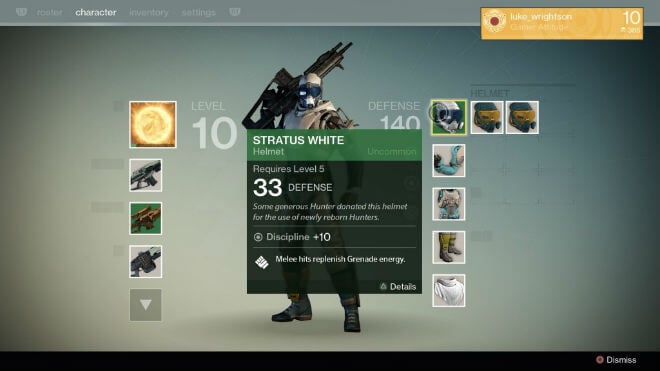
Destiny
 Destiny is another game where the UI is love/hate. There’s a lot of information that the player needs to see, but as a developer, you also want the game to feel accessible to new players.
They ended up with a very pleasant-looking product. And even if it can get a little cumbersome, or everything isn’t fully explained, for the most part, the UI does its job well.
If you want to hear about the design decisions Bungie went through to arrive at their final UI, here’s a nice long vid for you.
Tomb Raider
Tomb Raider is another good example of a UI staying quiet until you need it. And when it does pop up, it doesn’t distract you.
As you watch this video, notice how the action is taking place with little to no 2D HUD text appearing on the screen. And when the player is prompted to hit a button, the way the game displays that information is very inoffensive. Could any of your on-screen prompts be toned down? Is there a way to preserve immersion?
Persona 4
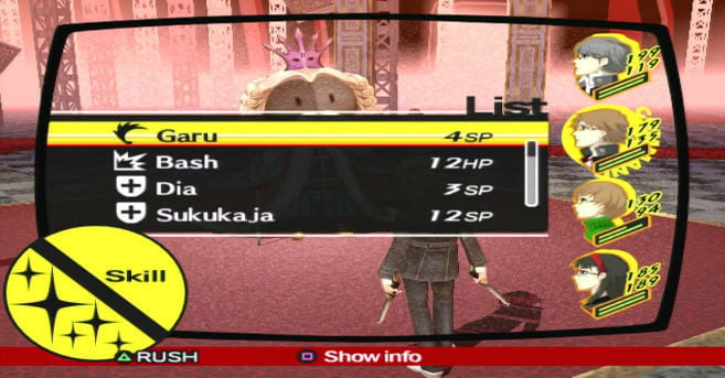
Persona isn’t a series that really gained in popularity until its third installment. That’s also when the UI and the rest of the game got a makeover with the same aesthetic. Every part of this game reinforces the same thematic undertones, UI included.
Even if you’ve never played it, it’s easy to get stuck watching it. Here’s a video to show you what we’re talking about.